 L'hypercube
🌡️ Temperature trends and anomalies
This interactive application explores temperatures observed in several French cities at two complementary scales: annual climate trends and daily departures from a climate normal.
📊 Two levels of interpretation
Annual trends
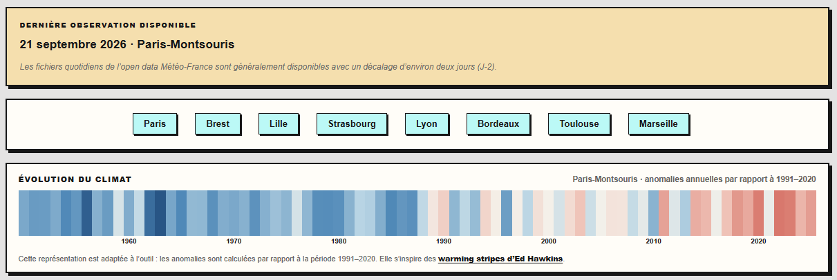
The climate stripes summarise changes in a station’s annual mean temperature. Each stripe represents one year: blue indicates a year cooler than the reference, while red indicates a warmer year.
This representation is inspired by the warming stripes created by Ed Hawkins , a climate scientist at the University of Reading. In the application, the stripes are calculated separately for each station and adapted to the 1991–2020 reference period. They therefore do not exactly reproduce the original visualisations’ series or reference periods.
Daily temperatures and anomalies
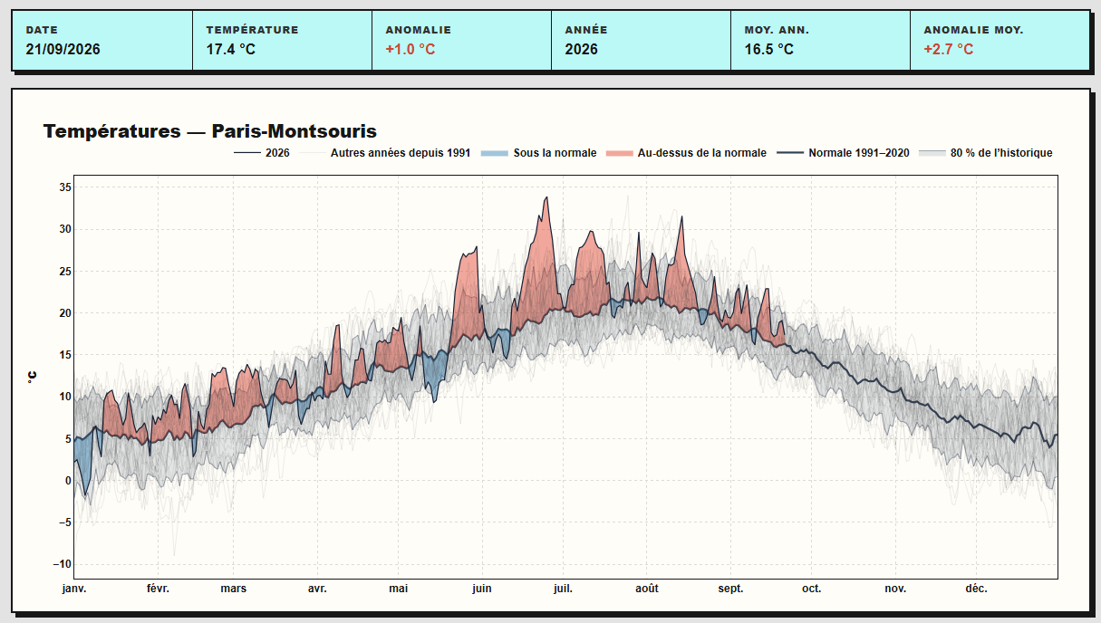
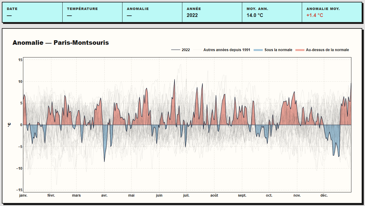
A second view can display either the daily mean temperatures for a selected year or their anomalies. Red areas indicate days above the normal, while blue areas indicate days below it.
Thin background curves represent the other available years, making it possible to place a particular day or warm spell within the station’s historical record.
The Anomaly mode removes the seasonal cycle and places the normal on a 0°C reference line. This makes it easier to compare departures throughout the year and across different years, independently of the temperatures usually expected in each season.
🗃️ Weather data
Observations come from the Données climatologiques de base quotidiennes dataset published by Météo-France on data.gouv.fr.
The application uses the daily mean temperatures already provided for eight stations: Paris-Montsouris, Brest, Lille, Strasbourg, Lyon, Bordeaux, Toulouse, and Marseille.
Two families of files feed the tool:
- historical files containing the series required to characterise past climate;
- recent files updated by Météo-France and used to extend the current years.
The open data are generally published with a delay of approximately two days (D-2). The latest date actually available is shown in the interface.
📐 The 1991–2020 climate normal
The normal is calculated separately for each station and each calendar day. For example, the normal for 15 July is the mean of all temperatures observed on 15 July between 1991 and 2020.
This method produces a daily seasonal cycle against which the selected year can be compared. The displayed anomaly is simply:
$$ \text{Anomaly} = \text{Observed temperature} - \text{1991–2020 normal} $$A positive anomaly indicates a day warmer than the normal for that date; a negative anomaly indicates a cooler day.
📏 “80% of the historical record”
The grey range in the daily chart is bounded by the 10th and 90th percentiles calculated for each calendar date. It therefore contains the central 80% of the reference values.
This range is not a forecast interval. It provides a reference for past variability: a value outside the range lies among either the coldest 10% or the warmest 10% of the historical sample for that date.
🗺️ A local perspective
Each series represents a weather station and describes conditions observed at that location. The results are neither an average for France nor Météo-France’s national thermal indicator.
Differences between cities may notably reflect relief, maritime influence, urbanisation, and the station’s immediate surroundings. The current year is also incomplete: its indicators summarise only the observations available so far.
The tool is therefore an entry point for exploring observations, not a replacement for authoritative climate indicators. The From weather to observed climate page provides a broader introduction to stations, reanalyses, and weather files.
⚙️ Data preparation and updates
The full departmental files are processed beforehand so that only the required stations and variables are retained. The useful data are stored in a lighter Parquet file, which is read directly when the application starts.
On the server, a daily task:
- retrieves the recent files for the relevant departments;
- selects and checks observations from the eight stations;
- updates the prepared file;
- restarts the application to publish the new values.
The interface is developed in Python using Dash
and Plotly
.